Vodafone - User Research Manager
Jan 2016 to May 2019
We only had analytics data to guide us—it told us the what. I had a strong hunger and curiosity to uncover the why behind it, so I set up the User Research Function.
One of my proudest achievements has been establishing user research functions from scratch at major organisations like Vodafone and Saint-Gobain. This involved building frameworks for user testing on crucial projects and existing user journeys, leading to the creation of vital personas that were previously unacknowledged.
- I worked with the finance team to create the budget needed to hire a meeting room, away from Vodafone HQ, and recruit participants per week, split into 2 face to face sessions.
- Supporting over 10 design squads I tested 2 initiatives/designs per week, with 5 participants per study, each day
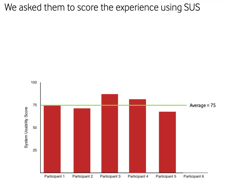
- Alongside this, I also ran unmoderated tests, tree tests, card sorts, and collected SUS scores using UserZoom (now UserTesting), evaluating live user journeys to uncover insights and identify key pain points.
- With a love of learning, open mindedness and a drive to make things better for the user I studied for and gained a Diploma of Higher Education in Psychology through the Open University. With a focus on usability and user insight, it provided valuable context and helped explain the psychology behind user behaviour, supporting the creation of effective and engaging online experiences.
- I crafted a mixture of practical skills in the research field including planning, executing and communicating studies that revealed the motivations and behaviours of users.
Some of the face-to-face testing involved a range of “choose a phone and contract” designs to refine a journey that still exists today. At times we tested individual pages, and at others the full end-to-end experience. The chatbot, known as Tobi, was also tested several times to help establish and shape the initial flow for choosing a SIM-only plan.
Example 1 = Re-inventing SIM Only
We started with a ‘fundamental question’ - “How can we meet the needs of our customers to increase acquisition sales"
Step 1: Consider your audience
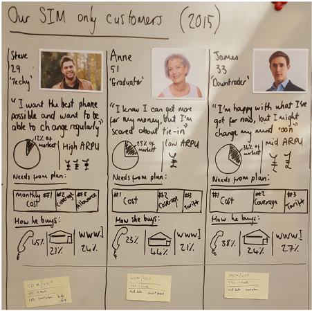
The marketing personas for SIM only from Consumer Product team - at the time of research study
Step 2 - Prepare for the study
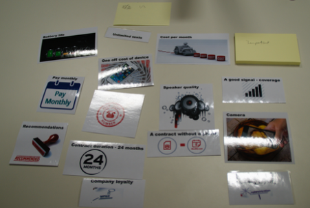
I created draggable 'phone features' for each participant to rate under a series of headings to show the importance and what they want included when considering their phone contract.
Through a series of 12 ‘Customer Experience Research’ interviews over two days, we uncovered some crucial insight about why our customers behave in the way they do, plus gained some knowledge about how SIM only products are perceived.
Step 3 - Perform the study and summarise the results
The results showed us that our customers want a ‘great deal’ with a shorter contract, so they have the flexibility to change their phone when they like. This aligned with previous Market Research.
- Nearly all would prefer an ‘Unlimited’ contract, not because they want to use it excessively, but for the peace of mind that they won’t go ‘out of bundle’.
- The prospect of changing their phone number, in some cases, provoked a strong emotional response - as it was seen as incredibly
- impactful when having to share new numbers with friends/family.

There were some key themes observed when the participants were asked to choose their top 5 considerations fro choosing a contract
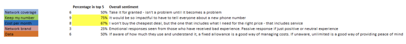
'Customers are petrified of losing their number and will stay to avoid the hassle of switching'
Customers feel compelled to switch from their provider, but, they will make the move for a few main reasons:
1. Network performance
2. Customer service
3. Value for money
If a provider fails the customer for any of the reasons above, they are less likely to even consider that provider in the future.
Step 4 - Recommendations
The opportunity to improve the acquisition experience, were:

Example 2 = Buy an iPhone - using Tobi the chatbot
Thursday 5th April - in Reading - Vodafone’s user experience team undertook usability testing to validate a prototype design that allowed the participant to purchase an iPhone X through the Vodafone Chatbot. This testing allowed us to validate the design and identify key findings. In particular, they were asked if it was clear how to start the purchase, if they could place an order successfully, if they understood the choices, and if it was clear how to change their choices.
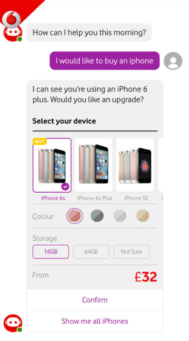
- All participants knew to click on one of the options to start and continued to purchase an iPhone X, as requested
- 4 out of 5 were confused by the ‘From’ price, they weren’t sure if it was the one-off cost or the monthly cost.
- They were all able to continue as if they were going to purchase a product
Various UI design elements have been applied to the ‘Buy a phone through the Vodafone Chatbot’. The main aim of the user testing was to gather insight into participants understanding of these design elements and the general flow of the user experience. The feedback from these sessions will also help to inform the Chatbot style guide designs, going forwards.
Example 3 = Choose your bundle - 3 options
Monday 7th November - in Reading - Vodafone's user experience team undertook usability testing to validate the ‘Choose your bundle page refresh’ prototypes for CTR13. This testing allowed us to validate three proposed prototypes to the ‘Choose your bundle’ page, including proposed changes to a particular upsell and double your data presentation, to identify key findings from target users.
Option 1
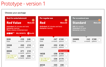
1 out of 6 participants preferred this design, key findings were:
- Easy to click through plans, clearly sees which ones include entertainment
- Liked the extras and accessories all being on one page
- Plans are clear, you can see quickly up front what there is
- After seeing the live site, one participant said, “this is much better”
- “I don’t like it, it looks like you’re booking a flight”
- “Too much stuff on the page”
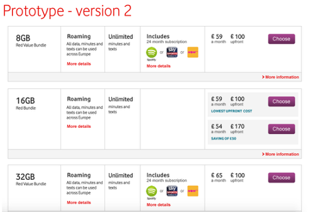
Option 2
3 out of 6 participants preferred this design, key findings were:
- “It’s clear and easy to choose”
- “It’s easier to find because you scroll down in numerical order, it’s clear and all in a line”
- Scrolled down, “it’s easier to find the information, it’s quicker and clearer”
- “This is easier as well, similar to version 1, everything is clear what’s included in the price”
- “Nice and clear, would still want to see information on how to keep their number though”
Option 3
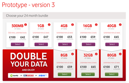
2 out of 6 participants preferred this design, key findings were:
- “It’s clear that you can double your data, showing the immediate costs”
- “There’s a lot of information there, but I can see that the 2nd row is double your data”
- “This one looks good, its better because you can see everything”
- “A bit overwhelming and double your data is leaping out at me, the only other difference I see is the button colours”
- “I find it a bit too much, it looks like a betting page”
I have conducted numerous studies and gained significant experience working as a UX researcher, using both qualitative and quantitative research methods. I can demonstrate a strong understanding of behavioural analysis and statistical concepts, supported by strong analytical skills that enable me to conduct key research, as well as monitor, refine, and enhance ongoing studies.